Friday, April 30, 2010

mid ohio food bank news letter

So, after a long time of not posting on my blog, here is the lowdown on my latest project. Viscomm II was challenged to create a newsletter for the Mid Ohio Food Bank, Operation Feed. We were given the branding information and a recent news letter created in MS Word from which we were to take copy. From the beginning I imagined the old newsletter as a kind of template for what could have been if the creator had the necessary tools. I began by picking two of the most obvious flaw in the old design: bad color combinations and low quality images. I decided that I wanted to go with a clean white background in order to make the colors I was left to work with work better together. From there I did a little bit searching about Swiss design, to see how to make simple look good. After that began work on the masthead, which gave me a little bit of direction as to where I wanted to take the project. In order to ad a bit more of a theme I used a font found at acidfonts.com titled FOOD! To provide the necessary graphics to create simple visual markers. To keep the often clashing colors looking like they belong I regularly changed the tint to 30%.

Below are some side by side examples of the new newsletter v. the old one:

Thursday, May 7, 2009

Why's everybody always picking on me?


recreate charlie brown in illustrator...

Man... illustrator... not as easy as I thought... I eventually got into the swing of things... But I have a lot more to learn.

Tuesday, April 28, 2009

Oh yeah...


So this... needs more... I'm thinking color... a background... some lighting effects... Alas, the time allotted to work on this in class has expired. So, this is what this is for now, until, of course, the time comes when it can be finished on my free time. Paper cutout on a toned background. On to the next project.

Tuesday, April 21, 2009

a fireside chat with norman chaney pt. 1


So, here's a little thumbnail for the caricature of a professor project. I'm working on describing Norman Chaney's personality. At first I was going to go with a traditional caricature with giant head and exaggerated features, but as the thumbnailing process continued I decided I liked him more with a regular size head, so here he sits in front of a fireplace with his dog by his side about to tell you a story or give a lecture or whatever with some interesting peices of history behind him.


Realizing the background is going to play a large role in the finished piece I decided to do a series of sketches detailing many of the background elements. There are more of these... but... that is where I am right now.

Sunday, April 19, 2009

finish!


All done (actually it has been finished since thursday...) This was a tough ride for me I had no clue how to make the image look how I wanted to, until I figured out how to adjust the color balance, then I figured out how to make things glow, and then It all just kinda fell into place. I had to make a lighter version of it so the image would print out properly and not all sucky and dark. I'm a much bigger fan of the digital dark version because the text and ground are still visible without being actually legable. ...and whatnot. Next week: Norman Chaney: a fireside chat.

Thursday, April 16, 2009

ketchup

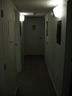
Okay, more progress: Reference photos have been taken and retaken again. Now that I finally have a set that I can safely start out with (see below) I've finally been able to really start woking hardcore..

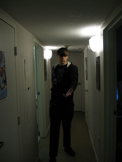
(note, the roommate who took this really isn't well versed in the art of photographing (ie getting the entire figure in the frame...)


From there I began changing lighting ever so slightly, and skin tone to give that ghostly glow I was going for, as well as eliminating the eyes.


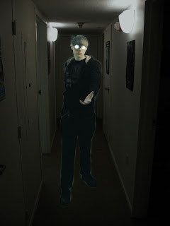
There is still a lot of work left.

Tuesday, April 14, 2009

The portrait of the artist as a portrait pt. II

From the horrible self portrait in the last post I've done a series of sketches to get the new image in my head out on paper. I then scanned them, cut out the bits that fit and added a few photoshop effects to better display what I think the final product will look like.

Notice how I've moved the viewer's eye out so we get a full view of the figure in the background adding a quieter more contemplative approach. Also I've decided to move from the dominant red lines of the first image to a ghostly blue aura about the figure. The background has been darkened and the figure lightened to give the idea that the figure is haunting the space. Finally note the glowing floating apple central to the peice.